
Best Practices for Using Bold, Capitalized, and Uppercase Fonts in Web Design for Optimal UX
web design UX tips typography font styling uppercase UI design best practices frontend
As a developer who’s worked with designers of all levels, I’ve seen how easy it is for junior UI/UX designers to get caught up in the excitement of their first designs and become satisfied too quickly with what they’ve done. But design is a continuous journey of learning and improvement.
This article is especially for those who are just starting out and want to create clean, engaging, and user-friendly web designs. Typography—specifically bold, capitalized, and uppercase fonts—can be a game-changer when used effectively. But remember, it’s easy to overdo it. We’ll explore best practices to help you use these font styles wisely, improving readability and guiding your users’ attention where it matters most.
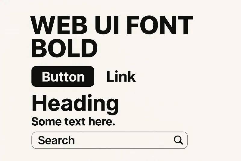
1. Bold Fonts: To Highlight Key Information
When to Use Bold Fonts:
Bold fonts are great for emphasizing important content, such as headings, subheadings, and action buttons. They help guide the user’s focus to key elements of your design.
Best Practices:
- Use bold to emphasize important content like titles, headings, and call-to-action (CTA) buttons.
- Apply bold sparingly. Too much bold text can dilute its effectiveness.
- Use for short, critical pieces of information rather than large blocks of text.
Examples:
- Headings: Bold makes your headings stand out from the rest of the text.
- Call-to-Action Buttons: Bold buttons grab the user’s attention and encourage action.
- Key Data Points: Use bold to highlight important terms, stats, or important product features.
2. Capitalized Fonts: For Clear Hierarchy and Formality
When to Use Capitalized Fonts:
Capitalized text is ideal for titles, section headers, and navigation items. It adds a sense of formality and importance to these elements, helping users easily navigate and understand the structure of your website.
Best Practices:
- Use for section titles, headings, and navigation items to add emphasis.
- Avoid capitalizing long paragraphs or body text to prevent diminishing readability.
- Use capitalized fonts for important headings to help establish a clear visual hierarchy.
Examples:
- Section Titles: Capitalized titles help separate different content sections.
- Navigation Links: It creates a neat, uniform, and easy-to-read navigation structure.
- Product Names or Categories: Capitalization helps certain products or categories stand out.
3. Uppercase Fonts: For Impact and Visual Emphasis
When to Use Uppercase Fonts:
Uppercase fonts are often used to create visual impact and emphasize key elements like promotions or taglines. It’s great for short text or banners where you want to grab the user’s attention immediately.
Best Practices:
- Use uppercase for short phrases or banners where you want to create urgency or highlight a special offer.
- Avoid using uppercase for body text or long sentences, as it can make reading harder.
- Combine uppercase with other typography elements like bold or italic for greater impact.
Examples:
- Banners or Promotional Tags: Use uppercase for attention-grabbing elements like “SALE NOW ON.”
- Taglines: “EXPERIENCE THE FUTURE OF TECHNOLOGY” in uppercase can help reinforce your brand message.
- Calls to Action: Using uppercase for CTAs like “GET STARTED” or “JOIN NOW” can drive action.
4. When to Avoid Bold, Capitalized, and Uppercase Fonts
While these font styles can improve UX, overusing them can overwhelm the user and harm readability.
Avoid when:
- Overused in paragraphs: Using bold, capitalized, or uppercase text in long paragraphs makes reading difficult.
- Inconsistent use: Applying these styles randomly can confuse users and disrupt the visual hierarchy.
- Over-cluttering the design: Too many bold or uppercase elements can create a chaotic design.
Conclusion
Bold, capitalized, and uppercase fonts are powerful tools in web design that help enhance the user experience. When used correctly, they can guide attention, clarify visual hierarchy, and make your content stand out. However, moderation is key. By following the best practices outlined in this article, you can create a website that is visually appealing, easy to navigate, and engaging for users.
Want to learn more?
For more insights on typography best practices, check out these resources:
Current Benefits:
- Improve readability and accessibility of content
- Create clear visual hierarchy and structure
- Enhance focus on important actions and information